


UNS
rebranding of a Saudi social networking application
Project Team
Services
Field
Project summary
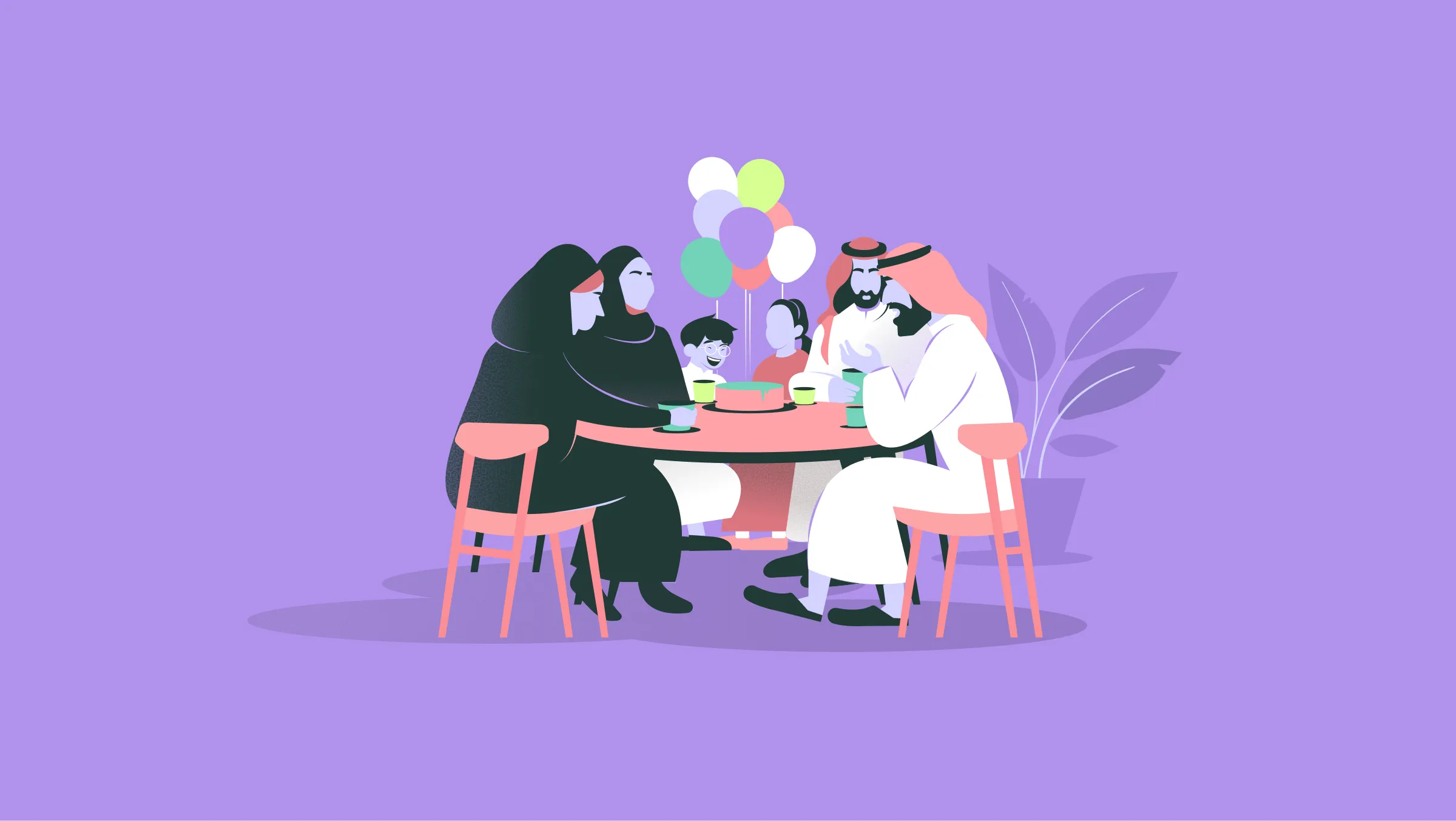
The Uns logo is built around clarity, warmth, and cultural authenticity, while remaining globally accessible.
At its core, the logo is based on the Arabic word أُنس, a term that conveys human closeness, familiarity, and the comfort of being together. The typography was intentionally designed with soft, balanced, and rounded forms to express openness and approachability rather than rigidity or formality.The visual identity avoids sharp edges and aggressive geometry. Instead, it reflects the brand’s core purpose: bringing people together in a calm, welcoming, and emotionally connected way.
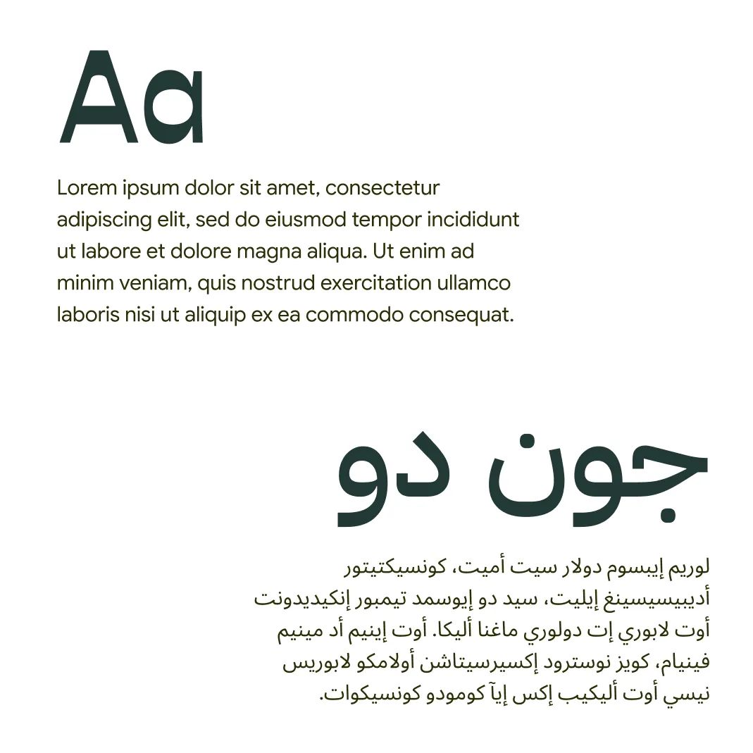
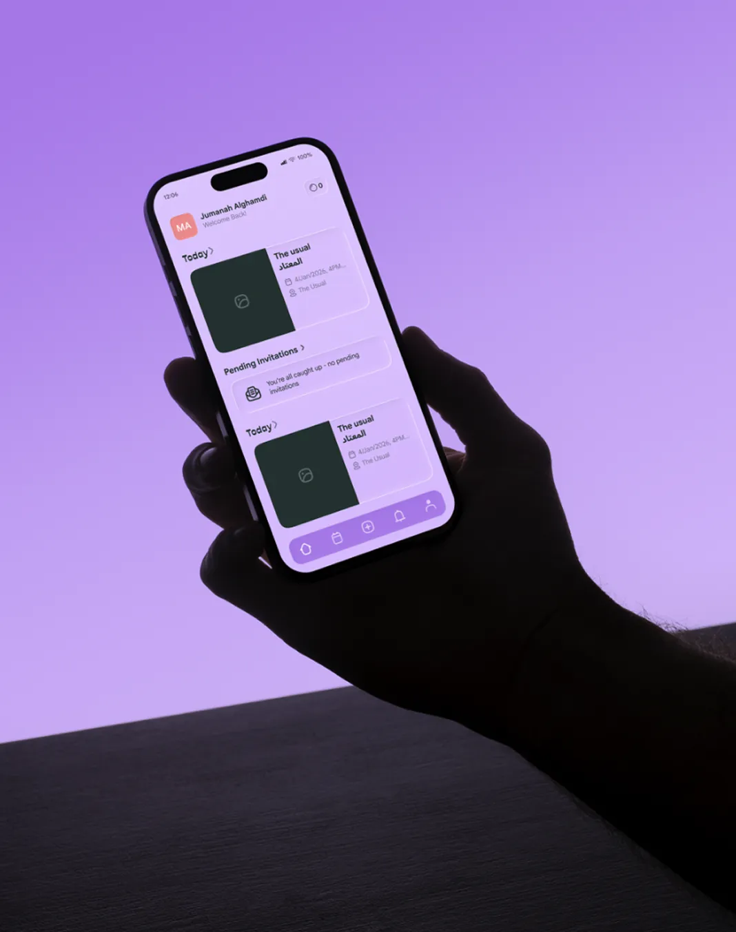
One of the main challenges of the project was creating harmony between Arabic and Latin typography — not only within the logo itself, but also across the motion system, UI design, and the broader visual identity — resulting in a cohesive and culturally sensitive brand experience.





related projects
L'Été
Deux Freres
